
BAM = Before and After Makeover
I saw with my little eye one graph that could benefit from a makeover using some of the templates I previously created. Therefore, as a very normal thing to do, I asked to its creator to share with me the data source so I could do something with it. He kindly answered and I shared with him back my makeover (here is the thread in case you are curious…).
This was the initial plot:
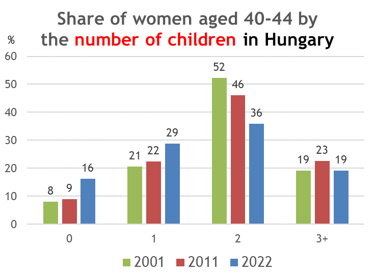
I thought that this was an interesting story and the data was showing something remarkable about the changes for families/women in Hungary. However, this story was a bit hard to extract from the plot.
Using a different bar for each year, in my opinion, is a bit contra-intuitive because for evolution in time we expect some “spaghetti graph” instead of bar plots (generally speaking). With this viz, your eyes need to jump from one category to the other and compare years with number of children.
On the other hand, maybe the year 2011 is not necessary for the main story behind this plot (0 children has doubled and 2-children families is significantly reduced between 2001 and 2022). That made me think again about the “slope graph”. Makeover shown in Figure 2.
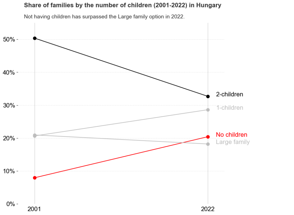
Note that I have also simplified the title, because “women aged 40-44” is a bit confusing and not adding value to the story. I reformulated it as “families” instead (even knowing that there exist many definitions of families, because I think it does not hinder the main take-away).
In any case, Figure 2 may be less colourful and a bit more boring than Figure 1, but I think it does a better job focusing on the story. By the way, these are the words from the creator of Figure 1:
That’s great. It perfectly captures the strong convergences between the women with different numbers of children.
@TothGCsaba
And he retweeted my plot, so I am very happy with the results. A big thanks to Toth for sharing knowledge and for the inspiration!


Leave a comment