
Here we have a small challenge from Storytelling with data for a makeover!
Figure 1 is the initial proposal.
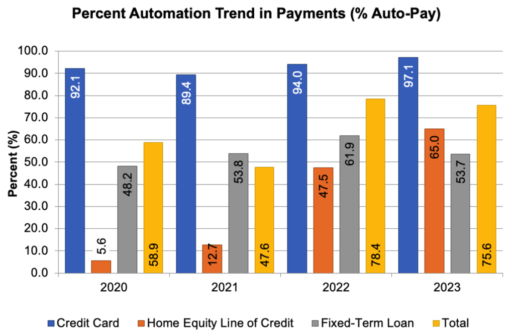
First, we need some time to understand better the data, and if you have a similar knowledge on credits as I have, here you have the explanation about “Home Equity Line of Credit”.
Some hints to navigate through new graphs:
- Understand the data displayed. Just read carefully.
- Look for potential correlations between the variables. In this case, Total variable seems the upper level of the other types of payments.
- Ask questions to the data owner. Not today… 😦
- Look for the outlier. We can see that only “Home Equity Line of Credit” (HELOC from now on) is increasing significantly.
So, IMHO the story here is that HELOC is driving the increase on the total percentage of Auto-Pay. That was the hard part! Now we only need to choose the best graph to highlight our story…
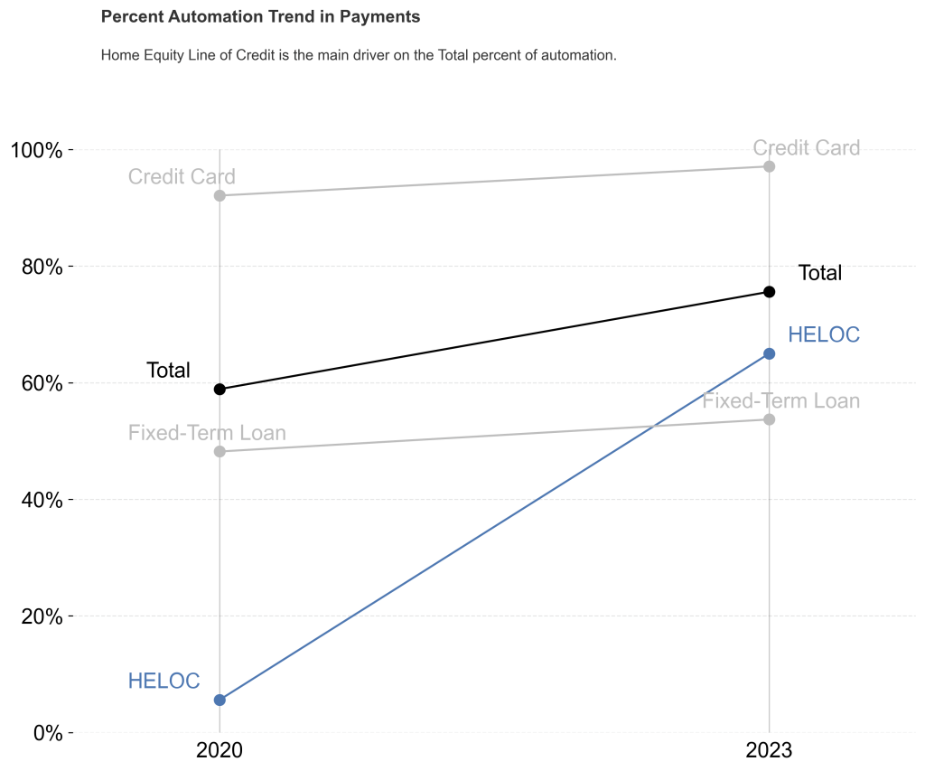
I have chosen a Slope graph inspired by the word “Trend” in the initial title and because our story is about one category increasing more than the others. Figure 2 shows my proposal!
Final comments:
- Using colours to highlight HELOC trend in blue, and Total in black.
- Removing the years in the middle, as they only introduce noise in our story.
That’s the end of this Trending Topic!


Leave a comment