
Now we will keep it simple and focus on the story behind the data. After some Exploratory Data Analysis, I have created a new graph to replace the original one (see Figure 1) with the same data behind.
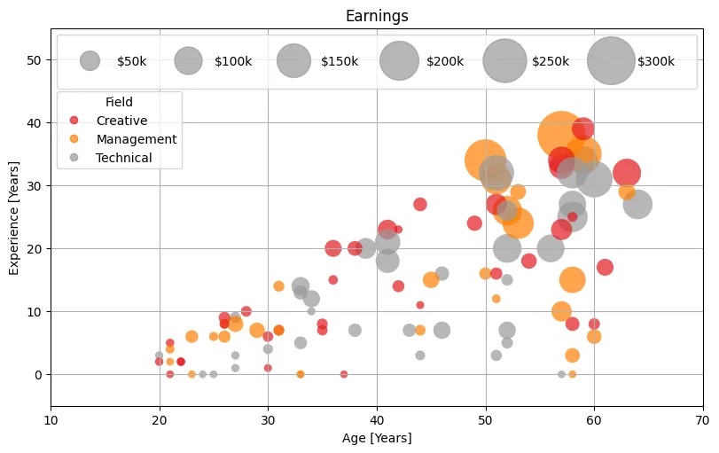
Important warning: the original data was synthetically generated, so please do not decide your career path based on Figure 2…
We can see in Figure 2 how Creative field is significantly underpaid compared with Technical and Management, specially for very experienced roles.
Toni Almagro (creativebut technical!)
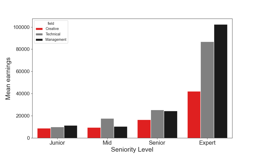
What did I change? First, I grouped the data based on different seniority levels to simplify the view. Bar plots are quite easy to read (we are very used to them) and comparison between “fields” is quite straight forward. On the other hand, I decided to highlight in red the creative field and make darker the others to help the reader to focus on the right place.
Conclusion: my figure is much simpler (less cool visually) and has a a story behind!
Keep It Simple, Supercoolperson!
Toni


Leave a comment