
I often want to use this acronym but I am always scared of insulting anyone…
Keep it Simple, Stupid
KISS
Very often I have this on my mind whenever I am listening an explanation or understanding a graph. We will focus on an example shown in Figure 1. Please take a minute to explore this graph.
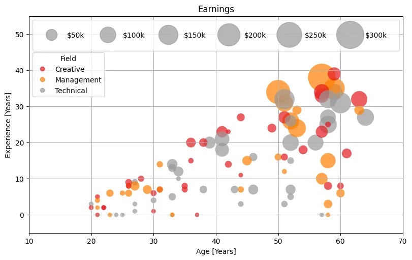
Q: How many times your eyes have been moving left-right top-down when exploring the plot?
A: I am dizzy!😵💫
Too much information within an awkward display. Moreover, axis X and Y are quite redundant and confusing. We will find a strong correlation between experience and age… on the other hand, whats the point? What’s the story behind?
I will not share the source of this plot but in its defense, this was just used as an example of “cool” visuals available in Python. However, I feel that this is a poor example of graph because it is focusing entirely on the technical without considering The Story, and that’s a dark path…
In my next publication, I will redo this plot focusing on the story. Stay tuned!


Leave a comment