
These are my recommendations to achieve a healthy data visualization work life:
1. Never cook sweet desserts, in particular remove these out of your menu:
- Pie charts 🥧
- Donut charts 🍩
These graphs may cause confusion and indigestion. Use next recommendation instead.
2. Consume protein Bars 💪🏻. Use as many as you need: vertical bar graphs, horizontal bar graphs, stacked…
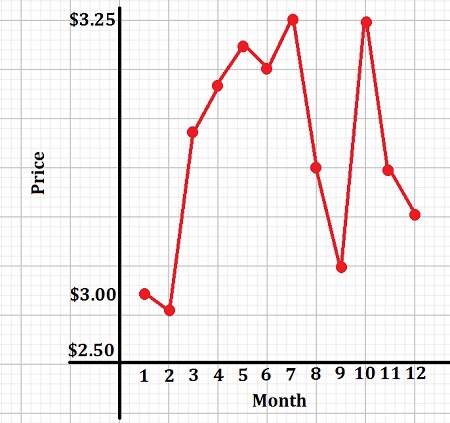
3. Don’t mess around with the quantities shown in your axis 📏. It may create hypertension to use a range from $2.5 to $3.25 claiming that you see a big “gap” (as shown in Figure 1).
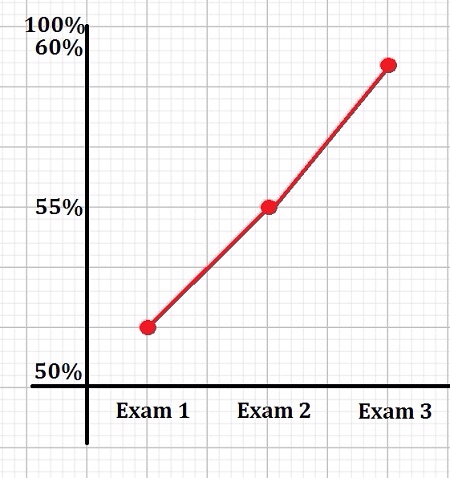
4. Avoid gluttony for line graphs 🍝: don’t use connected lines 📈if your independent variable is not continuous or temporal (use bar plots 📊 instead). I have seen cases like Figure 2 too many times 🤯.
5. Work out with graphs 🏋️: it is a good idea to try several options before choosing your final design. Always focus on good readability and impact.
6. Always clean the kitchen when you are done cooking 👩🍳: a good cook always remove clutter once she/he has finished preparing the menu. Remove gridlines, avoid using colorful backgrounds, do you really need all those different colors…
7. Intermittent fasting is always a good idea to avoid graph poisoning 🤢: balance your graphs with text, empty spaces and other visuals. It is never cool to see a presentation or a document with one graph after another.
8. Be consistent with your menu choices 🎨: if you decided in Figure 1 to use blue for Adidas and red color for Nike PLEASE make sure that these are not reversed in Figure 2. It will blow your audience mind otherwise.
9. Name and catalog your recipes ✍🏻: axis’ labels are key to understand your graphs. Make clear the variables you are displaying and always include units.
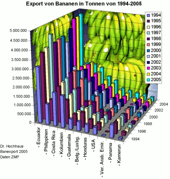
10. Avoid bananas 🍌. Creating too complex graphs is not recommended. If it takes more than two minutes to digest the graph, maybe the story behind is not clear yet. Keep it simple. In Figure 3 you can see a real-world example of a banana chart… no comments.
Disclaimer: in case of feeling overwhelmed or dizzy, please stop this diet inmediately and consult a data science specialist.


Leave a comment