
In this post series, I will be reviewing some “fail graphs”, one per post, extracting some general lessons. Although there exist no Truth in the art of crafting graphs, I will be challenging these plots always from a technical perspective (legibility, use of attributes, space…). So, nothing personal here.
I recommend you to review the graph critically before reading my comments!
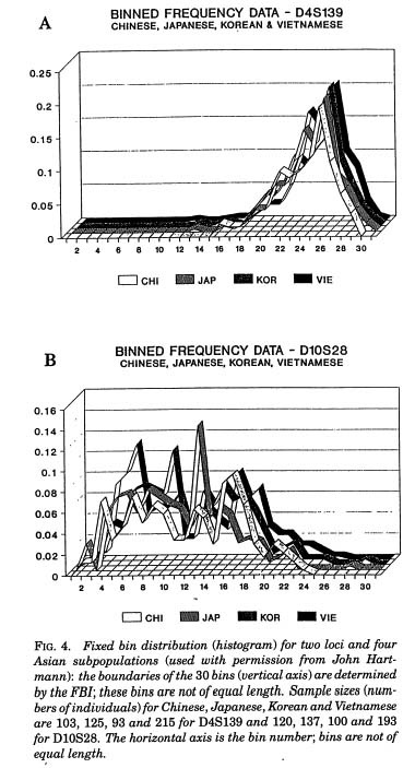
The accused
Comments
From these plots is very difficult to extract any conclusions because it is very difficult to read. One ribbon mixes with the others and finding the vertical position is difficult due to the 3D perspective. Moreover, the two black ribbons (KOR and VIE) look the same.
Lessons learned
- Never use 3D plots. Period. Never. Nope.
- Color your lines for colorblindness when possible. Pro tip: use different line patterns together with colors.
Remarks: in the reference (I took this plot from a webpage), you will find also their own comments.
Reference
- Top 10 worst graphs: https://www.biostat.wisc.edu/~kbroman/topten_worstgraphs/


Leave a comment