
What: a data point may be the best visual you need.
Why: sometimes a single number or row from your table may highlight an important event more effectively than a graph. On the other hand, providing particular examples with numbers (by a data point or a small table) is a useful trick to help your target audience to understand complex data issues, specially when dealing with big data.
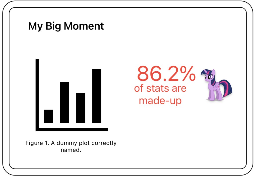
How: using text in your slides is a great way to highlight a message, as shown in Sketch 1.
In Table 1, I provide an example of the second use case of data points on your deliverables. I found this data issue during the exploratory analysis using histograms, but for communicating with the customer I included some actual data points. Note also how I am using red color to highlight the wrong number and green to suggest that it is a healthy data point.
| Leg Id | Origin | Destination | Price |
| 42 | Madrid | Valencia | 300 |
| 69 | Madrid | Valencia | 60000 |
Where: this tool is specially interesting for slides, but you will use numbers naturally in your docs.


Leave a comment